Conference sessions that rock usability
I recently attended an industry conference on Rich Internet (RIA) technology that was billed as pertaining to the user experience (UX) folks, albeit loosely. While I attended the multi-day conference I was musing on what an ideal conference would be for people the work primarily in the usability/user experience/user centered design space.
To be fair, one of the primary criteria for attending this RIA conference was the proximity from where I work, while still getting some amount of useful knowledge. Budgets not being what they used to be, it has been increasingly difficult to make a case for travel to California or Florida; which are both popular conference destinations.
I’ve attended both UIE(1) and Nielsen/Norman(2) conferences for usability numerous times over the years, and while both Jakob Nielsen and Jared Spool are both engaging and popular speakers I’ve been to the big top and seen the show.
As a result I began thinking about a more user-generated curriculum by people who are not consultants but are embedded user experience people that not only solve problems on a daily basis but fight for usability resources, lab space and good user centered design in-house every day.
Believing that visualization is the first step toward action I’ve penned 10 conference sessions that would rock usability.
1. Selling Usability: How to get a budget and a staff in 12 easy slides
One of the largest issues that user experience folks have is actually selling usability within their organization.
Having attended many conferences, this question usually shows up in one of the Q&A sessions. Knowing that the questioner’s company has paid a boatload of money to send said person to the conference, the presenter points out this simple fact, says it’s a good thing, and then usually moves on.
What I would want is a way to make this more actionable.
I would envision this session as part work session and part presentation where the final deliverable is a set of PowerPoint slides you could take with you and use as a toolkit to furthering usability within your organization. PowerPoint has always been the coin of the realm in corporations.
Since every company is a bit different I would see a base set of slides with lots of metrics and quotes on how doing usability early saves money, and highlighting specific instances where well known companies saved money and how they did it.
As an interactive, user generated session; attendees would contribute slides and then speak to them as part of the group.
The end result would be an vast set of slides and talking points to further user centered design. This would be very interactive and very real, as well as providing a neat way to get introductions to people that feel your pain and fight the good fight.
2. Tools and Tricks to amaze and stun your friends
There are lots of ways to slice and dice the user experience and get information from your users.
This tools and techniques session highlights quick usability testing and methodology tricks to further usability by including users, stakeholders, and developers in the process in a fun and low risk way.
Two good examples that I personally picked up from Jared Spool’s podcasts are confidence indicators and 5-second tests.
The confidence indicator is simple way to gage how sure people are of what they are telling you. This is done in a non-judgmental way quite easily with poker chips. Simply put, you give a participant a set of 10 poker chips and ask them questions. The participants then indicate how sure they are of their answer by pushing some chips towards you. The more chips, the more confident they are of their answer.
Another example is 5-second tests(3) which is a simple usability test that helps you identify the most prominent elements of the user interface.
In this test you give a participant a quick look at a screen or printout and then take it away, after which you ask them questions about interacting with the page.
Quick hits like these are the allen keys and files in your toolbox. While they may never rise to the level of a hammer or saw, they have their place and are very useful. They are also easily explainable and low impact, meaning stakeholders won’t be threatened by it, hopefully opening the door to larger testing engagements.
This session would include 10 different methods tools and tricks with appropriate discussion leading to a lot of new stuff to add to the toolbox.
3. Rich Media, same as the old media?
One of my most recent struggles is how to effectively design and convey the user experience when the experience is not based on a static layout.
Screen design in the HTML world was, if not easy, it was well understood. The new crop of tools and interfaces such as Flash, Flex, Silverlight and AJAX change the playing filed and in many cased let developers to horrific things that look slick and finished.
Jakob Nielsen's “Flash: 99% Bad”(4) is a harbinger of what some designers and developers will do with a new tool that has lots of whiz-bang effects.
New media tools have their own visual language that makes effects very easy to apply and use.
UX people need to have an understanding of these tools, what they can and can’t do to be able to better illustrate the user experience.
It is difficult to recommend the best possible solution without knowing what your options are. With these new technologies it becomes easier for developers to produce slick, finished looking “prototypes” and as a result can sidestep all the knowledge that has been learned relating to user experience in the domain being developed in.
This session would highlight actionable techniques for illustrating dynamic media, and illustrate the UX functions and features within each of the target technologies.
4. Getting Published and the size of the rocks they throw
There is a lot of good work that goes on that unfortunately most of it does not make it out into the mainstream, making it difficult to advance the field.
This session would discuss and map a path of how to get published, the venues for publishing and the pros and cons to each publishing stream.
Also discusses is how to join new and interesting open source development projects(5) to help improve usability and raise your personal awareness level within the industry.
5. User Testing is about the user
Traditional user testing can be time consuming and a daunting task if you have never run tests before, but they don’t have to be.
This session takes attendees through the entire process for testing inside a corporate environment and outside in the public.
How many people do you really need to test with? How many tasks are too many? How can you get employees to participate in tests? When should I lead my users when they are stuck? These are just some of the questioned to be answered are each step in the process is outlined from facilitators that run tests on a daily basis.
Developing test scripts, determining the right participants, monitoring tests and keeping stakeholders in the loop, running tests and highlighting results successfully are all important touch points in the process.
Included in the session would be snippets from user tests (good and bad), highlighting techniques for facilitators and how to avoid pitfalls that can skew test results.
6. What’s YOUR problem?
Interaction design problems are mulled over and tested every day. For every problem there can be a series of comparable solutions.
Presented are multiple solutions to sets of common UI and information presentation problems in an interactive discussion and presentation format. Session participants would be requested to submit examples and work product that lead to their solutions and what they learned along the way.
This frank look at problems and solutions would lead to developing heuristics(6) and design patterns(7) that could be extrapolated solve larger layout and navigation problems.
7. Content, Search and other evil things
As intranets, extranets and general sites mature content is continually created, edited and sometimes replaced. Content owners both maintain and abandon their content as job responsibilities change and people move on from companies.
This session discusses how to manage content through its entire lifecycle and how to sunset old content and bubble up good content through content management, mining search and editorial review.
Content management, workflow and best practices are discussed with thoughtful examples from commercial software, homegrown, and open source content management applications; blogs, wikis and other user generated content sources.
8. Sharpening the Stick: Improving core competencies
Content Heuristics are well known but how can you present the application of heuristics in a meaningful, actionable and persuasive way?
How can you best facilitate card sorting(8) with a room full of type-A personalities or run tests across the globe?
When is the best time to use focus groups and who should you include in the process?
Do you use wire frames to illustrate user flow, and do they need to be more than doodles on napkins?
Heuristic evaluation, card sorting, focus groups and wire framing are all techniques used on a continual basis. This session discusses what you can do to make your techniques and results more effective, easier to produce and more persuasive to developers and stakeholders.
9. Content Governance and Style Guides & Frameworks, oh my
As organizations mature there are an ever-growing group of content providers including internal resources, third party vendors, integration groups and even interns.
Content governance(9) is a process where web content from diverse groups in a organization can be best harnessed for the betterment of visitors and to best use the available resources throughout an organization.
This session discusses how content governance plays a role in keeping the org on track, where, when, how and why to use style guides and frameworks and the problems and benefits to a structured environment.
I hope you’ve enjoyed conference sessions that rock usability. As you see from the list there are many tool based sessions, research and solution based sessions but they all have a reoccurring theme of interaction between user centered practitioners to not only present ideas and solutions but the recharge the creative and analytical batteries within a common guild.
Hopefully it was interesting and thought provoking spurring a wealth of conference session to come to a location near you or me or simply on the Internet.
If you do plan of developing sessions in part or in whole please give me a shout out, and maybe even a free pass.
To be fair, one of the primary criteria for attending this RIA conference was the proximity from where I work, while still getting some amount of useful knowledge. Budgets not being what they used to be, it has been increasingly difficult to make a case for travel to California or Florida; which are both popular conference destinations.
I’ve attended both UIE(1) and Nielsen/Norman(2) conferences for usability numerous times over the years, and while both Jakob Nielsen and Jared Spool are both engaging and popular speakers I’ve been to the big top and seen the show.
As a result I began thinking about a more user-generated curriculum by people who are not consultants but are embedded user experience people that not only solve problems on a daily basis but fight for usability resources, lab space and good user centered design in-house every day.
Believing that visualization is the first step toward action I’ve penned 10 conference sessions that would rock usability.
1. Selling Usability: How to get a budget and a staff in 12 easy slides
One of the largest issues that user experience folks have is actually selling usability within their organization.
Having attended many conferences, this question usually shows up in one of the Q&A sessions. Knowing that the questioner’s company has paid a boatload of money to send said person to the conference, the presenter points out this simple fact, says it’s a good thing, and then usually moves on.
What I would want is a way to make this more actionable.
I would envision this session as part work session and part presentation where the final deliverable is a set of PowerPoint slides you could take with you and use as a toolkit to furthering usability within your organization. PowerPoint has always been the coin of the realm in corporations.
Since every company is a bit different I would see a base set of slides with lots of metrics and quotes on how doing usability early saves money, and highlighting specific instances where well known companies saved money and how they did it.
As an interactive, user generated session; attendees would contribute slides and then speak to them as part of the group.
The end result would be an vast set of slides and talking points to further user centered design. This would be very interactive and very real, as well as providing a neat way to get introductions to people that feel your pain and fight the good fight.
2. Tools and Tricks to amaze and stun your friends
There are lots of ways to slice and dice the user experience and get information from your users.
This tools and techniques session highlights quick usability testing and methodology tricks to further usability by including users, stakeholders, and developers in the process in a fun and low risk way.
Two good examples that I personally picked up from Jared Spool’s podcasts are confidence indicators and 5-second tests.
The confidence indicator is simple way to gage how sure people are of what they are telling you. This is done in a non-judgmental way quite easily with poker chips. Simply put, you give a participant a set of 10 poker chips and ask them questions. The participants then indicate how sure they are of their answer by pushing some chips towards you. The more chips, the more confident they are of their answer.
Another example is 5-second tests(3) which is a simple usability test that helps you identify the most prominent elements of the user interface.
In this test you give a participant a quick look at a screen or printout and then take it away, after which you ask them questions about interacting with the page.
Quick hits like these are the allen keys and files in your toolbox. While they may never rise to the level of a hammer or saw, they have their place and are very useful. They are also easily explainable and low impact, meaning stakeholders won’t be threatened by it, hopefully opening the door to larger testing engagements.
This session would include 10 different methods tools and tricks with appropriate discussion leading to a lot of new stuff to add to the toolbox.
3. Rich Media, same as the old media?
One of my most recent struggles is how to effectively design and convey the user experience when the experience is not based on a static layout.
Screen design in the HTML world was, if not easy, it was well understood. The new crop of tools and interfaces such as Flash, Flex, Silverlight and AJAX change the playing filed and in many cased let developers to horrific things that look slick and finished.
Jakob Nielsen's “Flash: 99% Bad”(4) is a harbinger of what some designers and developers will do with a new tool that has lots of whiz-bang effects.
New media tools have their own visual language that makes effects very easy to apply and use.
UX people need to have an understanding of these tools, what they can and can’t do to be able to better illustrate the user experience.
It is difficult to recommend the best possible solution without knowing what your options are. With these new technologies it becomes easier for developers to produce slick, finished looking “prototypes” and as a result can sidestep all the knowledge that has been learned relating to user experience in the domain being developed in.
This session would highlight actionable techniques for illustrating dynamic media, and illustrate the UX functions and features within each of the target technologies.
4. Getting Published and the size of the rocks they throw
There is a lot of good work that goes on that unfortunately most of it does not make it out into the mainstream, making it difficult to advance the field.
This session would discuss and map a path of how to get published, the venues for publishing and the pros and cons to each publishing stream.
Also discusses is how to join new and interesting open source development projects(5) to help improve usability and raise your personal awareness level within the industry.
5. User Testing is about the user
Traditional user testing can be time consuming and a daunting task if you have never run tests before, but they don’t have to be.
This session takes attendees through the entire process for testing inside a corporate environment and outside in the public.
How many people do you really need to test with? How many tasks are too many? How can you get employees to participate in tests? When should I lead my users when they are stuck? These are just some of the questioned to be answered are each step in the process is outlined from facilitators that run tests on a daily basis.
Developing test scripts, determining the right participants, monitoring tests and keeping stakeholders in the loop, running tests and highlighting results successfully are all important touch points in the process.
Included in the session would be snippets from user tests (good and bad), highlighting techniques for facilitators and how to avoid pitfalls that can skew test results.
6. What’s YOUR problem?
Interaction design problems are mulled over and tested every day. For every problem there can be a series of comparable solutions.
Presented are multiple solutions to sets of common UI and information presentation problems in an interactive discussion and presentation format. Session participants would be requested to submit examples and work product that lead to their solutions and what they learned along the way.
This frank look at problems and solutions would lead to developing heuristics(6) and design patterns(7) that could be extrapolated solve larger layout and navigation problems.
7. Content, Search and other evil things
As intranets, extranets and general sites mature content is continually created, edited and sometimes replaced. Content owners both maintain and abandon their content as job responsibilities change and people move on from companies.
This session discusses how to manage content through its entire lifecycle and how to sunset old content and bubble up good content through content management, mining search and editorial review.
Content management, workflow and best practices are discussed with thoughtful examples from commercial software, homegrown, and open source content management applications; blogs, wikis and other user generated content sources.
8. Sharpening the Stick: Improving core competencies
Content Heuristics are well known but how can you present the application of heuristics in a meaningful, actionable and persuasive way?
How can you best facilitate card sorting(8) with a room full of type-A personalities or run tests across the globe?
When is the best time to use focus groups and who should you include in the process?
Do you use wire frames to illustrate user flow, and do they need to be more than doodles on napkins?
Heuristic evaluation, card sorting, focus groups and wire framing are all techniques used on a continual basis. This session discusses what you can do to make your techniques and results more effective, easier to produce and more persuasive to developers and stakeholders.
9. Content Governance and Style Guides & Frameworks, oh my
As organizations mature there are an ever-growing group of content providers including internal resources, third party vendors, integration groups and even interns.
Content governance(9) is a process where web content from diverse groups in a organization can be best harnessed for the betterment of visitors and to best use the available resources throughout an organization.
This session discusses how content governance plays a role in keeping the org on track, where, when, how and why to use style guides and frameworks and the problems and benefits to a structured environment.
10. Research and Resources: The truth is out there
Unless you work in a consultancy there’s a large chance that you are the only user experience person in the building or, if you are lucky, part of a small (maybe 2-3) handful of folks doing user centered design.
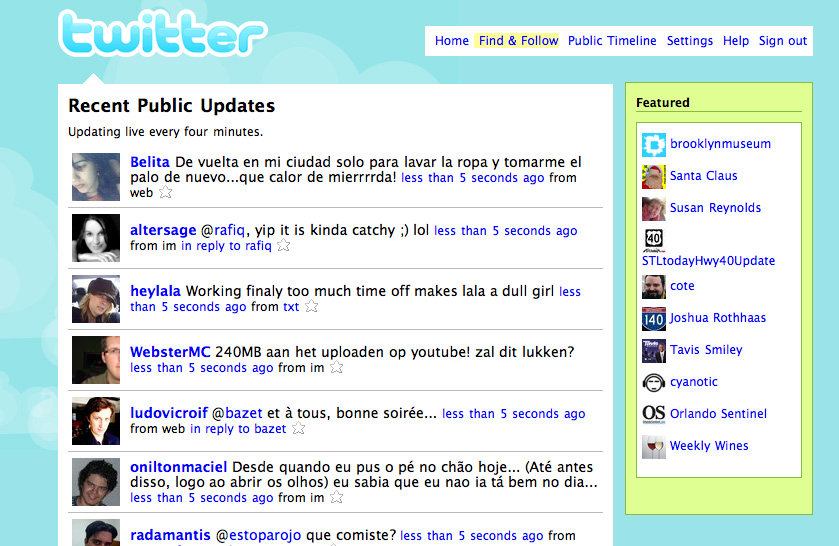
There are many resources from books, podcasts, websites, articles and even twitter friends(10) out there that can come to the rescue. This session highlights some of the best and provides a takeaway of resources so you can put together your own resource library and support group.
Unless you work in a consultancy there’s a large chance that you are the only user experience person in the building or, if you are lucky, part of a small (maybe 2-3) handful of folks doing user centered design.
There are many resources from books, podcasts, websites, articles and even twitter friends(10) out there that can come to the rescue. This session highlights some of the best and provides a takeaway of resources so you can put together your own resource library and support group.
I hope you’ve enjoyed conference sessions that rock usability. As you see from the list there are many tool based sessions, research and solution based sessions but they all have a reoccurring theme of interaction between user centered practitioners to not only present ideas and solutions but the recharge the creative and analytical batteries within a common guild.
Hopefully it was interesting and thought provoking spurring a wealth of conference session to come to a location near you or me or simply on the Internet.
If you do plan of developing sessions in part or in whole please give me a shout out, and maybe even a free pass.
Bibliography:
1. User Interface Engineering (UIE)
Consulting firm and conferences headed by Jared M. Spool
2. NN/g : Nielsen Norman Group
Usability consulting, training & user experience group, Jakob Nielsen principle.
3. 5-Second Tests: Measuring Your Site's Content Pages
Christine Perfetti & UIE
4. Jakob Nielsen's Alertbox: Flash: 99% Bad
Original Article on Flash
5. Design in the Open
Open source development projects
6. Usability Heuristics for Rich Internet Applications
7. Yahoo! Design pattern library
8. Card Sorting, a definitive guide
9. Defining a Model for Content Governance
10. Follow me on twitter
8. Card Sorting, a definitive guide
9. Defining a Model for Content Governance
10. Follow me on twitter
Labels: conferences, usability
posted by David at
5:46 AM
1 Comments
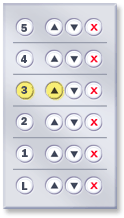 It is surprising that these developers have not tried adding a cancel button and directional buttons next to each floor button, because as we all know, sometimes you might just want to change your mind.
