How easy is it to print?
This article is for those of you who have been hardened on word processors for what seems like your entire life.
To you, the idea of having trouble printing is nonsense. Printing is one of the core functions on a computer. In fact, when you first got your Commodore 64 one of the only things it could do was print, so when I say that printing is hard, you should find it hard to believe. But it is.
Last evening I spent about 45 minutes with my father trying to guide him to print a document from Microsoft Excel. Now, my father is not a dumb man, he may be a bit on the technology light side, but in general he can navigate around pretty well. But, when he needed to print his document so columns were not being cut off he was lost.
 Step 2: The print menu
You might think this is where our story begins and ends, but on the general print menu there is no option to change the print orientation. This is odd, since most pages are set up portrait orientation, but most spreadsheets are landscape orientation.
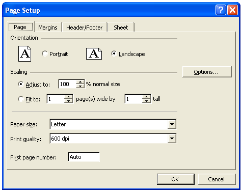
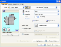 Step 3: Properties
The properties option contains our orientation menu, along with a host of other options, most of which would confuse my poor father. The problem here is there is no preview to see if your data fits on the page. And, there is no easy way to get to the place to see the data (the previous screen), so you need to click ‘ok’, then preview to see the result.
 Step 4: Clicking preview
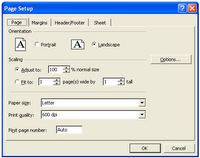
If the preview is not to your liking, there is a handy “setup” link, which, you would think, would lead the user back to the complication whence you came. But alas, is brings you to a different ‘setup’ menu.
Step 5: Send the file to me and I’ll fix it.
In then end, my father was not able to print his spreadsheet in its current format for many reasons. Some of which were technical and some because he did not have the knowledge of Excel to make the modifications necessary to fix it.
While many of us have reached the point of Excel wizardry in reformatting screens to our liking, I would suspect there are just as many who are confused and end up taping together multiple print outs unnecessarily. To this, I say the failure is in the system. The system should be smart enough to know the orientation of the document and be able to change (or suggest to change) the orientation to our needs. The system should also make it simple for the user to find commands, and present the most used options in a single location without the need to navigate several screens. Additionally, the system should make it easy to navigation to a single representation (one view) of user options and make it easy to go back and modify them without the need to guess or start over.
And the user... well, the user should learn how to use Excel.
To you, the idea of having trouble printing is nonsense. Printing is one of the core functions on a computer. In fact, when you first got your Commodore 64 one of the only things it could do was print, so when I say that printing is hard, you should find it hard to believe. But it is.
Last evening I spent about 45 minutes with my father trying to guide him to print a document from Microsoft Excel. Now, my father is not a dumb man, he may be a bit on the technology light side, but in general he can navigate around pretty well. But, when he needed to print his document so columns were not being cut off he was lost.
Step 1: Hidden Options
Starting from the beginning, Microsoft has decided to hide options at random from menus. So, to print, you can’t simply select “print”, first you need to expand the menu to show all the menu options. Not ideal, but definitely doable.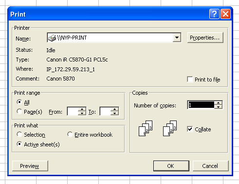 Step 2: The print menu
You might think this is where our story begins and ends, but on the general print menu there is no option to change the print orientation. This is odd, since most pages are set up portrait orientation, but most spreadsheets are landscape orientation.
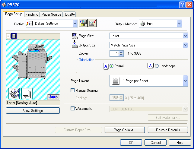 Step 3: Properties
The properties option contains our orientation menu, along with a host of other options, most of which would confuse my poor father. The problem here is there is no preview to see if your data fits on the page. And, there is no easy way to get to the place to see the data (the previous screen), so you need to click ‘ok’, then preview to see the result.
 Step 4: Clicking preview
If the preview is not to your liking, there is a handy “setup” link, which, you would think, would lead the user back to the complication whence you came. But alas, is brings you to a different ‘setup’ menu.
Step 5: Send the file to me and I’ll fix it.
In then end, my father was not able to print his spreadsheet in its current format for many reasons. Some of which were technical and some because he did not have the knowledge of Excel to make the modifications necessary to fix it.
While many of us have reached the point of Excel wizardry in reformatting screens to our liking, I would suspect there are just as many who are confused and end up taping together multiple print outs unnecessarily. To this, I say the failure is in the system. The system should be smart enough to know the orientation of the document and be able to change (or suggest to change) the orientation to our needs. The system should also make it simple for the user to find commands, and present the most used options in a single location without the need to navigate several screens. Additionally, the system should make it easy to navigation to a single representation (one view) of user options and make it easy to go back and modify them without the need to guess or start over.
And the user... well, the user should learn how to use Excel.
posted by David at
8:38 AM
0 Comments
![]()
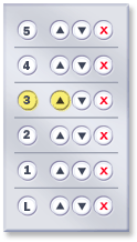 It is surprising that these developers have not tried adding a cancel button and directional buttons next to each floor button, because as we all know, sometimes you might just want to change your mind.
