Usability of Joost
 Thanks to the fine folks at Connected Internet I was able to play with a beta of Joost.
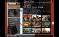
Joost is a video player application that streams on demand video directly to your computer and has a host of associated add to enhance the service including channel guide, search, video controls and interactive chat functionality.
The service itself is impressive; the streaming was of high quality with minimal service interruptions. The selection of content is good, especially given their new-ness, and the integration of services is clean and truly integrated. Having used other media services before I would cringe at clicking any of the buttons for fear they would launch an external window, but to my amazement all the features tested were integrated in to the display.
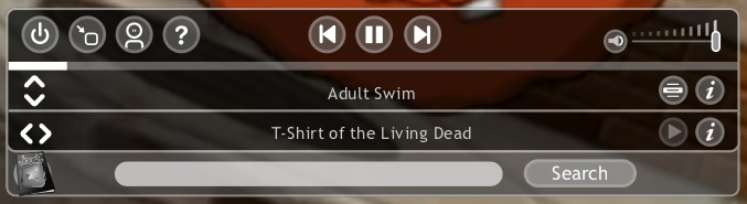
In order for software, or any system of that matter, to do something new the user must pass the gulf of execution, which in simple terms is the user must bring their level of knowledge up the level needed to use a product, or the product needs to bring its level down to the user. Icons are a common area where the user knowledge and product knowledge sometimes miss each other.
Some icons however contain harder concepts, and as such require additional help. This is the case with the MyJoost and MyChannels options on either side of the player. For these the icons have been married to actual text.
One of the more interesting concepts in Joost is the chat functionality. In this I think Joost may have missed the mark. It is difficult to have a collective experience when everyone is not seeing the same thing at the same time, and I think they will find this function will get little actual use.
A better function may be more akin to Twitter, the microblogging service. Since the user controls the real-time why not let users peg comments to different parts of the stream, like a user commentary. This would allow for an interactive experience while avoiding the real-time viewing problems.
 Integration with the stream is one of the nicest features of Joost, controls are presented in an overlay of the content, so users can multitask for shows or videos while they are watching. For this reason I understand why Joost would want their player to appear full screen when launched. This helps with the overall immersive experience; it does however limit a user’s ability to multitask outside of the product.
Overall Joost has provided a very user centric application. Now it’s time to go watch Action! With Jay Mohr (a great comic and frequent guest on Opie and Anthony and Ron and Fez), just one of the shows available on the service.
Check Joost out yourself. If you need an invite, post a comment and I’ll send you one.
posted by David at
7:25 AM
![]()


2 Comments:
A very nice "review". I will link to this from my blog. Today alone I've sent out around 40 Joost invitations during the last 4 hours.
Great work, David!
www.petersen-inc.dk
Well it turns out I had to write another Joost related post, so its two links instead of one ;)
I hope that goes too :-)
Post a Comment
<< Home